The afternoon schedule was filled with two interesting speakers from the field of type design, both coming from the Netherlands. Peter Matthias Noordzij spoke about the philosophy of their type foundry TEFF (The Enschedé Font Foundry) and what makes their approach special. They have been designing type digitally for 20 years and yet only published 8-10 fonts. This is because they don't feel that it´s appropriate to release a new font every season just because it´s fashionable. TEFF releases fonts when they think it makes sense. The designer talked about the process and challenges of designing Burgundica, Lexicon, Trinité, Geronimo and Ruse. It was interesting to see, that when letterpress typefaces are being digitalised they don't try to make them perfect but keep the little imperfections that give each typeface it´s (historic) personality and individuality. Trinité is one of the most popular fonts used for book covers in the Netherlands. An interesting feature is the 0.5° oblique axis. This angle is so small, that it´s impossible to reproduce digitally. This makes you realise where the boundaries of digital media lie. A screen automatically sets a grid which restricts your design. Therefore digitalising fonts in this example is a threat to the quality of a typeface rather than a blessing.
Gerard Unger, the second speaker this afternoon, tied in with this topic. In his talk ´screen or paper or screen and paper' he discussed the possibilities and boundaries of both paper and screen media. The Dutch designer is Professor of Typography at the University of Leiden and visiting lecturer at the University of Reading at the Department of Typography and Graphic Communication and has designed many fonts that are being used all over the world. He is an expert in legibility and the reading process and a very entertaining speaker. He questioned the widespread assumption that screens require a different typography than paper and that cutting long texts into small chunks would aid legibility on screen. He says that we use the same eyes and brains for reading something from paper and from screen, it´s only a matter of (re-)learning how to read. Reading is older than typography, we don't need to adjust the technology but our reading habits. The iPhone and similar developments are beginning to transform our reading habits and what is considered legible. We need a guide for good typography for print and screen. Robert Bringhurst´s 'The Elements of Typographic Style' applied to the web is a start but we need also new typefaces that work in both of these media. Gerard Unger was one of the first digital type designers together with Adrian Frutiger, Hermann Zapf and Matthew Carter. When they digitalised type back in the 70s, they had to draw every single pixel by hand with black ink. That was when he calculated that the ideal resolution to capture all the nuances of traditional type would be 700dpi. He also gave an insight into his rather unusual type work which was very interesting and inspiring.
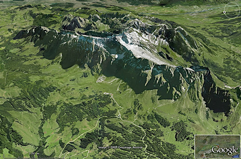
After so much food for thought, I need some fresh air. That´s why I'm gonna put on my walking boots and go hiking in the highest mountains of the Eastern part of Switzerland, the Appenzeller Land and the Säntis (8205 feet altitude). I'm gonna be clothed though, in case you were wondering.
Na das find ich ja erst noch toll! Wünsche Dir viel Spaß und komm gut wieder runter!
ReplyDelete