Tuesday 24 August 2010

Home Sweet Home


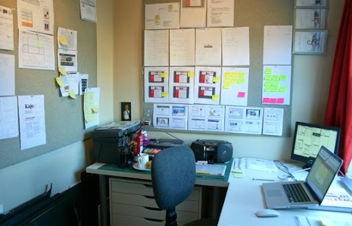
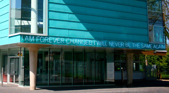
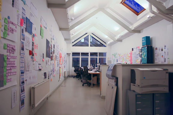
Long time no post – again. I've been busy packing up my life and moving from Bristol to sunny Cornwall, where I will study the final year of my degree. Not a bad place to be as you can see in these photos of my new home. I took this opportunity and sorted out all the things that needed sorting and that I never had the time for. Now all my boxes, books, folders, hard drives and whatever else was on my to-do list for a long time are clean and tidy and everything is prepared for a new start in Falmouth.

I am currently sitting on my lovely balcony most of the time, enjoying the sun and the sea views while trying to get a few things done. There are a few web projects I'm currently working on and I'm trying to make a start on my final year reading as well. I'm planning to have my personal website redesigned before the start of term too, so I can fully concentrate on my final year work.

So this is just a short update to say that I'm still alive, I'm keeping busy and I'm enjoying my life. Follow me on Twitter for all the latest updates.

Monday 14 June 2010

Spelling, Spanish, Contrast and Capitalism


It's been just over two weeks since I launched the User Centred Design poster. The responses have been overwhelming. I want to say thanks to the nearly 8000 visitors and more than 300 people who showed their appreciation through the facebook like button and the countless retweets. A big thanks to everyone who sent me their feedback and of course thank you to all those who sent a donation. It's great to know that my poster will be put to use in design studios, UX and UCD departments in the UK, Spain, the Netherlands, Germany, Switzerland and the United States to raise awareness, educate and stimulate discussion about User Centred Design.

Many people have blogged about the poster. A particular post that caught my eye can be found on michaeljpastor's Amplify. He writes
The other aspect to it that I love is his public-broadcating-like pledge button placed dead center on the initial view. And hence my buried lead - I think this is the future of "capitalism" in the information age (it won't replace it entirely, but will broaden it).

I agree with him. Embracing generosity and voluntary financial acknowledgement of good content is certainly something that will transform the future of capitalism, especially in an age where the old model of capitalism looks like a big fail whale and Open Source models seem more attractive than ever. On that note  — if you're in Bristol later this month — be sure to check out Clay Shirky at the Watershed.

I have released the poster under a CC license for exactly this reason. I want people to share, use and build upon the work. I believe that this is driving innovation a lot more effectively than clinging to some obscure patents or copyrights. Juan J. Martín Beltrán has sent me an e-mail with his amendments to the poster. He has actually translated the entire poster into Spanish! He did this because he believes this would make it easier to understand for the Spanish community. I agree and think this is absolutely amazing. As soon as I have some spare time, I'll typeset it properly and make it available for downloading. Great work, Juanjo!

A somewhat amusing question that was asked a lot is "Did you misspell the word centered on purpose?". Yes I actually did. Because I live in the UK, I used British spelling throughout the poster and the website. In British English, the word centred is spelled like this. Read this rather funny blog post by Jacob Cass, he explains it all. If you like, feel free to send me a version using US English spelling.

I have received some great and encouraging feedback and those of you who've been to the site more than once (10% according to the stats) might have noticed some minor changes. First of all Nick Dymond, a Team Rubber colleague, pointed out some accessibility issues and pointed me to the WAVE toolbar and the WCAG Contrast checker, two very useful Firefox addons for testing the accessibility of your website. One of the issues with the website was low contrast resulting from the light blue background and the white text. Thanks to Wouter Walmink and others who pointed this out. In the poster design I actually considered issues regarding low vision and colour blindness, the website however is a different story. The colours used in the print version don't simply translate to web design. Using the contrast checker, I found out more details about the ideal ratio of background colour to text colour. Although the tool doesn't consider images, it gave me a good idea how much contrast was needed to make the design more legible. It's still not perfect (the 'perfect' contrast would be black and white anyway) but the amendments I made now are a big improvement and a good compromise.

Another amendment worth paying attention to is in the credits. Eva-Lotta informed me that the iceberg metaphor originally stems from her colleague at Skype,  the wonderful Steve 'Buzz' Pearce. He used the metaphor in his and Andy Clarke's great talk 'Brand Experience vs User Experience' at FOWD London 2008. I highly recommend checking it out on Slideshare.

If you were considering to get a copy of the poster and haven't done it yet, the prints you can get from now on are A1 offset litho printed on 135gsm coated paper with glossy UV varnish. They are beautiful. I'll send them out rolled in a postal tube. The poster is actually designed to work well as a folded give-away like pamphlet measuring 210 x 210mm but it obviously works equally well as a poster on your wall.

Thanks again to everyone who contributed! I really appreciate it.

Friday 28 May 2010

Designing the Design Process


I've learnt a lot in the last three semesters which I spent abroad in Switzerland and Germany as well as in the UK, studying, interning and working in different fields of the creative industries.

A digital media module which I undertook in Zurich ignited a passion for usability and experience design. Working in the publishing industry in Munich gave me an insight into how old and new media work together (or sometimes not) and taught me traditional, analogue user interaction devices such as typography, layout or visual storytelling. When I returned to Bristol I was lucky enough to work with City ID, a renowned information design studio whose work I've admired since I first came to this city. They are a multi-disciplinary team of information designers, planners, urbanists, interaction designers, cartographers and product designers. That's an incredible mix of creativity, knowledge and strategic thinking which I had the opportunity to feed from.

I had the chance to dip in and out of different interesting projects, picking up useful knowledge and inspiring ideas to take and research further. When I was offered the opportunity to undertake a personal project--which would make a good portfolio piece and something to take home after the experience--I decided to combine what inspired me in Zurich and what I had learned at City ID and create an educational poster out of it.

The visiting lecturer who taught on the digital media module in Zurich is a user experience designer at Skype and she's not only very knowledgable but also very creative (check out her recent presentation on sketchnotes). Her lecture about the UX design process was based on the model of an iceberg. The visual part of a design is only the tip of it, the actual process lies underneath the surface. I took this model and started reading into Jesse James Garret's ideas and models described in his book "The Elements of User Experience". Talking to the interaction designers and information planners at City ID and reading through many of the great books in their library made me realise that there are a lot of models and ways to describe this process all underpinned with a myriad of principles, methods and techniques--but they all come down to a cyclical nature. A user centred design process is an iterative cycle where every step is evaluated against initially identified requirements of the users and then changed and improved until these requirements are met. For every stage of this process there are various principles and techniques that can be employed to move onto the next stage. At City ID I learnt that it is crucial to consider how a user interacts with your product. They design orientation and wayfinding solutions for cities around the world and the aim is to create an identity or sense of place through the experience that people have with the system. It is important to go through the information requirements at every stage of a user's journey to make sure that people get exactly the information they need at any given point following the principle of progressive disclosure.


Interestingly this also applies to webdesign or even editorial design. Working at the magazine in Munich, I experienced how a reader's "journey" is carefully planned and how visual cues, narratives, conventions as well as breaking with conventions impact on the reader's experience. A user centred design process is a universal principle and the key to an effective, efficient, engaging and intuitive product, interface or service in any field of design.

I'm very grateful that I had the opportunity to learn all this so far and to visualise the results of my learning. I've only just started to unravel the world of usability and experience design and I'm sure that I will learn a lot more in years to come. After I've finished my degree next year, I'd love to study either Information Design or User Experience Design at MA level.

I've set up a microsite to give you more information on the UCD poster project. You can download the poster for free as PDF or JPEG. You can also get a printed copy in A1 when you contribute a donation towards the cost of printing. What's left over goes towards my education. The poster is released under a Creative Commons license, so feel free to share it, use it or improve it as long as it's non-commercial and with attribution.

Thanks again to Eva-Lotta for the insightful workshops in Zurich and City ID for the experience and opportunity. You've started something.

Wednesday 12 May 2010

Commencing Phase 1


Just a quick update about how I'm getting on here. As you can see, things already beginning to look a little bit different. Note that this isn't the new design yet but rather a realigned design. Most things happened behind the scenes. I upgraded the backend and also removed the multi-language plugin. On the front end I fixed some CSS quirks (though there are still plenty of them) and changed the typography which is now using the CSS3 font-face and box-shadow properties for progressive enhancement. The logo has been replaced with the one that I've been using on my CV and printed portfolio recently. On the content side a massive search & replace mission in mySQL eventually removed all evidence that a German language blog ever existed. This was necessary so the layout doesn't break in the monolingual design. Although the parsing and display was done through a plugin, every post contained both language versions in the database and therefor would be displayed together when the plugin is disabled. I also went through the projects again and removed some embarrassing work that was left over from a certain university module. And finally I've rewritten the intro copy to keep it up to date.

In the next phase I am going to merge some areas and work on a new layout for the portfolio pages. I can't say when this is going to be finished as I'm rather busy with other work at the moment - which is still a good thing. I'll probably update the portfolio with new work before the new layout becomes apparent though, because I feel that I've held back some projects for too long now and I'm dying to share them with you.

Feel free to report any quirks or leave feedback in the comments.

Sunday 9 May 2010

Hello and Auf Wiedersehen


With the plans for my immediate future pretty much sorted out, I've now got two projects left to do until the summer break when I'm moving down to Cornwall. I can't say too much about the bigger one of the two except that it involves a new aspect of digital design (iPhone web apps) for me and another steep learning curve. I managed to stick to my self-devised curriculum which has pretty much been about digital design. It´s very exciting and lots of fun too.


I can tell you about the other project though, the relaunch of my personal website. I've been working on it sporadically between projects and other work and have finished all the planning work that is necessary before getting my hands dirty with design. I've decided to do a gradual relaunch, which means that I'm going to implement (and test) changes in smaller stages rather than revealing it all at once with a big ta-daa. The reason for this is that although it will probably be more work and take longer to fully implement all the changes, it will still save me time as I can start posting things sooner that I've been holding back until the relaunch.


So what are the changes? Here´s the plan so far: The website will be divided into portfolio and blog, I'll drop the separate introduction, about and contact pages and include them into the other two. There´s going to be a new content strategy for the blog. I'll also weed out all the trash from the portfolio. An important change for those who are reading this in German: I'm sorry to say that I'll drop the German-language blogging. The main reason for this is that translating each and every post into German takes up too much time and stops me from posting more. Although the language switching plugin has been awesome and made multilingual blogging really fun, it´s just not worth the effort anymore, at least in this context.


This website started as a personal website in German when I went to Northern Ireland. It helped me to keep in touch with friends and family and to write about my experiences in the foreign country. It changed to a bilingual blog and portfolio when I went to university and it still made sense to be bilingual throughout my time in Zurich and Munich. However the amount of people reading this in German who wouldn't be able to read it in English too is very small. The purpose of the new blog is not merely to keep friends and family updated anymore as it was years ago. For this I'll prefer the personal contact. The new blog will therefor have a new content strategy and will be in English only.


That´s pretty much the most important change. There will obviously be a lot of visual changes, a new logo and branding, new typography, a new structure, an updated backend and modern web technologies. All this will be implemented gradually over the next weeks. Things might break now and then and it could be a big mess at times, especially when the old database clashes with the new design. But let´s hope it all goes smoothly.


Stay tuned.

Friday 30 April 2010

A personal update


April is drawing to an end and nothing has changed in regards to this website. I promised (myself) to relaunch this month but let´s keep realistic: It´s not going to happen. It is however, along with one or two other commitments, now my first priority to get it done. Of course there are reasons for the delay, and contrary to what some might think when they know that I'm currently on a "year out", it´s not laziness, party and holiday. Since the start of the academic year I have worked full-time in two creative companies with international reputation and part-time in another. I have pursued freelance work for big and small clients and took part in design competitions with success. Since the start of 2010 I have wrapped up seven projects and successfully taught myself many of the things I always wanted to learn but university failed to address. I realised my plan to run my own "course" with my own "modules" and I can say it paid off. And I'm not finished yet.


When in the second year of my degree course at UWE my disappointment with the quality of teaching reached a peak, I decided to take up the opportunity to study a semester in Switzerland. This reinforced my impression that Graphic Design at UWE just isn't for me and I pulled the emergency break which led to the experience I'm having now. It was the right decision. At the point when I walked into the admin office and told them that I was taking time-out, everything was open. I didn't know whether I could sustain myself, what I would do with my time, whether I would change my mind and if I would return next year or not. The reaction from UWE was mainly shrugging shoulders and the deletion of my e-mail account. Formally for the university I became invisible since I wasn't a paying customer anymore.


Through the experience I've had since that day, the work I've done and the goals I've accomplished, I've come to realise that my career plans don't align with the teaching at the Graphic Design course at UWE. I'm pursuing a career in the creative industry, as a designer, consultant or whatever it may be. A career primarily concerned with solving problems creatively and visually for clients, users and audiences. I'm not an artist and I'm not the centre of my own work. However, most projects I was asked to undertake at UWE asked me to either express my personal opinion, to graphically expose intimate details of my personality/life, or to create work better described as conceptual art. A critical message seemed more important than the professional execution or aesthetic quality of the work. Judging it by using the weight of the file containing the development work as an indication for the mark instead of actually looking through it wasn't the only assessment flaw. Work seemed to be judged neither by form nor function but by the level of personal engagement and sacrifice. A usability-driven analytical approach to design was belittled in favour of a preferably physically painful and uncomfortable information gathering process like sitting in a space for 5 hours or performances subject to public ridicule. The result were clichés. The role of the designer as author, artist and social commentator was stressed particularly after some key positions in the staff hierarchy had changed. The line "Emphasis is placed on content gathering and authorship" was added to the official course description. This isn't what I signed up for.


Admittedly I've been moaning and complaining a lot. I've had many a rant about the course and it wasn't always fair or appropriate. My concern wasn't the 107 typos in 12 poorly photocopied briefs, it was everything that this entailed: the assumption that personal expression is more important than usability. After I have gained some distance now, I can reflect on it differently. I suppose my conclusion is: Each to their own. Some graphic designers are artists. For some the most important aspect of graphic design is political agitation and commentating on society. Few make a living through that, others are happy with a day job and "do graphic design" on the side. And then there´s another side of graphic design which is industry, client and consumer focussed and usability driven. A side where form follows function and aesthetics are an element of usability engineering. I suppose most good designers find a healthy balance of the two. But in order to find this balance, one needs to learn and experience both of them.


After going to Switzerland and studying modules in Digital Media, Scientific Visualisation and Information Design, subsequently working in Editorial Design with a prestigious magazine at one of the largest publishing houses in Germany, experiencing User Centred Design practice at an award-winning multi-disciplinary Information Design studio, pursuing freelance work for clients ranging from startups to multi-national corporations and now working in a Social Media ad agency, I'm much more aware of where I'm positioning myself in the creative industry. I regard this experience as part of the learning that contributes to my degree. This means—you guessed it—I didn't quit. Of course I'm continuing to study. I have one more year to go and I aim to follow the path I'm on now. I focus on the aspect of graphic design that makes sense to me. I don't know what kind of projects I'm going to do in the third year. Maybe they'll have an element of authorship and conceptual art. Maybe to some extent they'll reflect a personal aspect. One thing is for sure: My learning approach is going to be industry-focussed, collaborative, multi-disciplinary and usability-driven.


I will not graduate from UWE Bristol, but from the University College Falmouth in 2011.

Tuesday 9 March 2010

Busy times


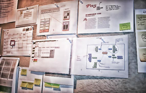
It´s gone a bit quiet on here but that doesn't mean that I'm being lazy. Like so often, when there´s lots going on, there´s no time to blog about it. My self-negotiated 'practice year' is coming along well and I'm as busy as ever developing new skills and experiencing the 'real world'. After a few commissioned projects like the BiWa website, the interactive e-cards for Allianz Group and the logo for c² Consulting Group, I took a step out of the door of my little studio and went on a work experience with City ID in Bristol. City ID is a design studio that develops award-winning design, information and wayfinding solutions for cities across the world. They are a multi-disciplinary team from a variety of specialist fields including information designers, urban designers, illustrators, cartographers, interface designers and product designers to name but a few. I took the opportunity to shadow them for four weeks and dip in and out of some of their exciting projects. I was also actively involved with information planning and research and developed a personal project with a result that I'm very proud of. What it is will be revealed soon, so watch this space.


Now I'm back at my little studio and work on a couple of websites, one of which is the complete redesign of paznow.com. My new site will go live in early April and so far it´s looking very good and I'm rather excited about it. Until then there probably won't be much blogging, so if you wanna know what´s going on in my life (and the little aches and pains I'm running into) then head over to twitter or facebook and subscribe to the RSS feed or e-mail updates so you won't miss the relaunch.