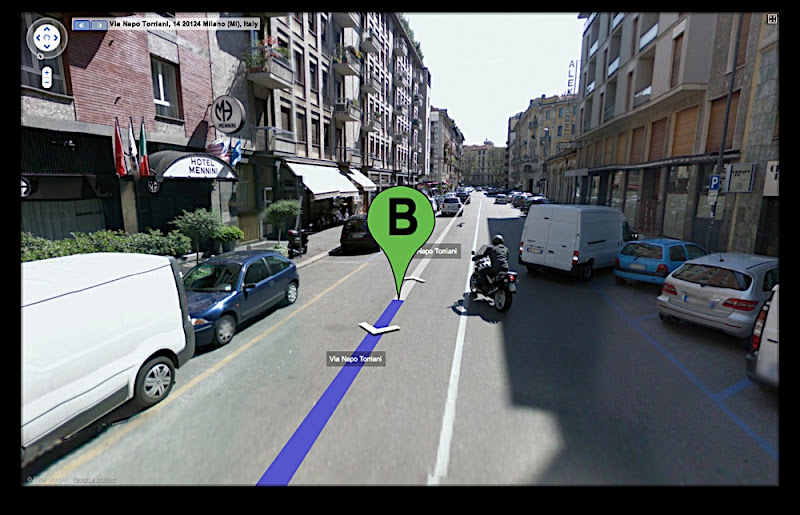
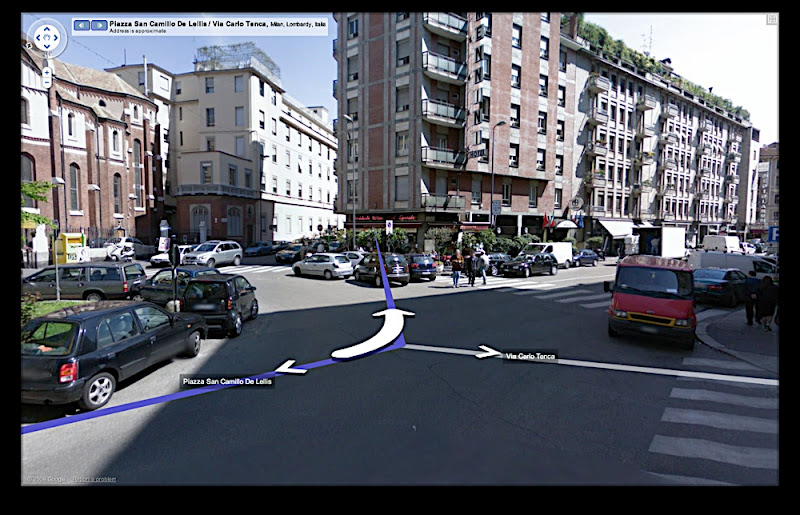
As some of you might know, I'm a big GoogleEarth addict. Something I've been wanting to do for a long time is to find out how far GoogleEarth can assist or even replace a trip to an unknown city. For my little weekend experiment I picked Milan as a city where I've never been before. I checked it out in Street View etc., trying to spot some interesting places and figure out how to get to the hotel. Now I'm curious how well this prepared me for the real trip. I'm gonna report afterwards. Watch this space.
This week I had the pleasure to meet the Gary Hustwit, the director of 'Helvetica' who came to our school to show us his new documentary Objectified. According to Hustwit this is the 2nd part of a trilogy of design documentaries. He didn't want to disclose what the third part is going to be about but if it´s as good as the first two I'm sure it'll be worth waiting a couple of years. I'd put my money on architecture, but who knows? Objectified is definitely worth watching. If you liked Helvetica, you'll like this. And now I'm addicted to El Ten Eleven.
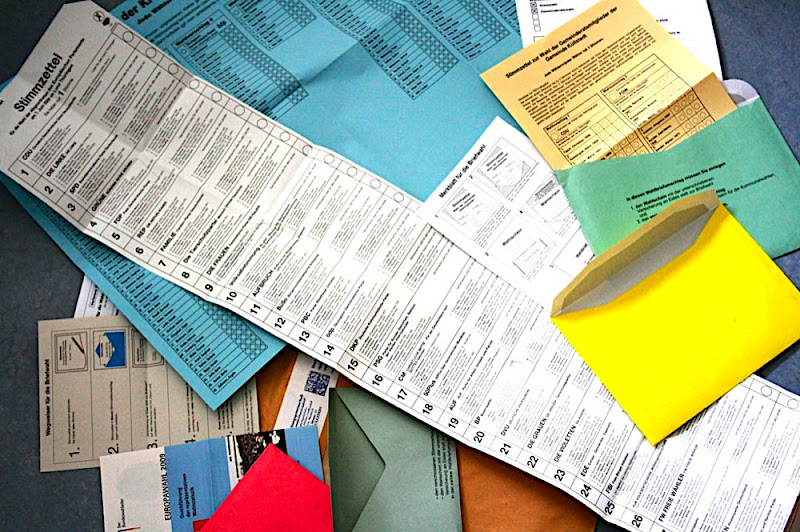
The Federal Republic of Germany celebrates 60 years of democracy this year. Although I'm there rather seldomly, I'm happy to follow my responsibilites as a German citizen at the ´super election year 2009'. Last time I found myself at the train to Berlin from where a plane was to take me abroad for the first time, when I ticked my boxes for the parliamentary elections. Today I found a large brown envelope in my post box and inside a lot of little colourful ones that again contained metre-long voting papers as well as instructions how to use them. It´s about the European parliamentary elections and the local elections and the whole super election package contains four envelopes in various colours and sizes and a phenomenal 40 inches long ballot paper as well as one in A2 and a little A4 one. I can cast my votes in an elaborate box ticking system in various different ways and then put envelopes into envelopes into envelopes. Particularly interesting though is the choice of parties for the European Parliament. It contains beside green, grey and purple parties also less known ones such as the Animal Protection Party, the Bavarian Party and even the Pirate Party of Germany. I wonder if the Anarchistic Pogo Party, that I remember from last time, was too drunk or hung over to participate this time.
OK, so I'm going to tick my boxes now, after all it doesn't happen very often that citizens are asked for their opinon. I can be glad that I'm not asked for my vote every week like in Switzerland. Perhaps I should vote blindfolded to be perfectly fair or maybe I ask the Wahl-o-Mat, a web application that compares my opinion on certain key issues with the policy of the parties. Oh before I forget: Happy birthday, democracy.
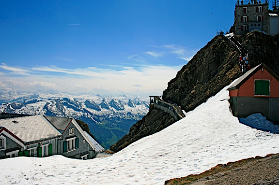
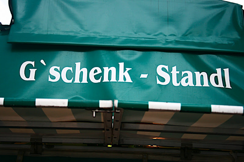
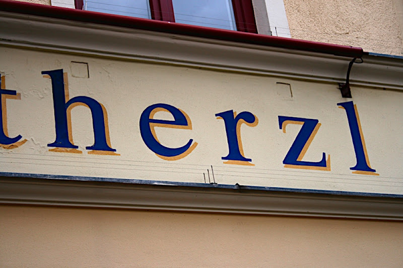
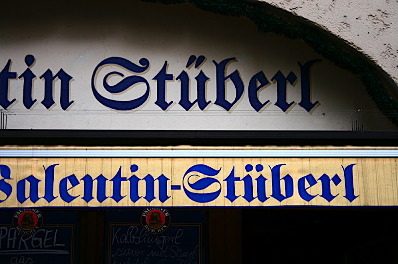
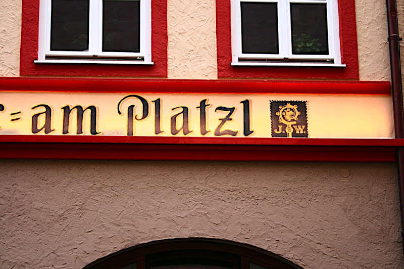
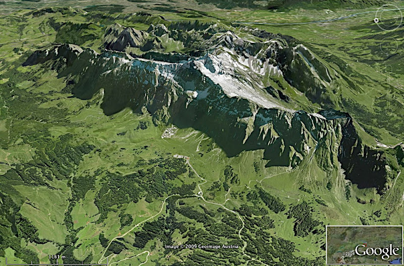
What a weekend. First the typography day, then a hike to the Säntis and a gorgeous view from 8205 feet altitude at a day that couldn't have been more beautiful (photos here or click on the picture above). And last but not least on Monday I got up at ten to five in the morning after 4 hours of sleep, travelled about 430 miles through 3 countries, spent 4 hours in the car, 5 on the train, all that for an interview (and a proper beer) in a town where I've never been before. Where? Have a guess. Hints below.
I just returned from the 6th 'Tag der Schrift' or typography day organised by the Swiss trade union for the media industries and the vocational school of design in Zurich. The event attracted many young and old designers, students and professionals alike. It felt like a really good mix. In the morning was largely about writing, when Sylvie Xing Cheng from China explained Japanese letterforms and Gottfried Pott talked about his calligraphy.
The afternoon schedule was filled with two interesting speakers from the field of type design, both coming from the Netherlands. Peter Matthias Noordzij spoke about the philosophy of their type foundry TEFF (The Enschedé Font Foundry) and what makes their approach special. They have been designing type digitally for 20 years and yet only published 8-10 fonts. This is because they don't feel that it´s appropriate to release a new font every season just because it´s fashionable. TEFF releases fonts when they think it makes sense. The designer talked about the process and challenges of designing Burgundica, Lexicon, Trinité, Geronimo and Ruse. It was interesting to see, that when letterpress typefaces are being digitalised they don't try to make them perfect but keep the little imperfections that give each typeface it´s (historic) personality and individuality. Trinité is one of the most popular fonts used for book covers in the Netherlands. An interesting feature is the 0.5° oblique axis. This angle is so small, that it´s impossible to reproduce digitally. This makes you realise where the boundaries of digital media lie. A screen automatically sets a grid which restricts your design. Therefore digitalising fonts in this example is a threat to the quality of a typeface rather than a blessing.
Gerard Unger, the second speaker this afternoon, tied in with this topic. In his talk ´screen or paper or screen and paper' he discussed the possibilities and boundaries of both paper and screen media. The Dutch designer is Professor of Typography at the University of Leiden and visiting lecturer at the University of Reading at the Department of Typography and Graphic Communication and has designed many fonts that are being used all over the world. He is an expert in legibility and the reading process and a very entertaining speaker. He questioned the widespread assumption that screens require a different typography than paper and that cutting long texts into small chunks would aid legibility on screen. He says that we use the same eyes and brains for reading something from paper and from screen, it´s only a matter of (re-)learning how to read. Reading is older than typography, we don't need to adjust the technology but our reading habits. The iPhone and similar developments are beginning to transform our reading habits and what is considered legible. We need a guide for good typography for print and screen. Robert Bringhurst´s 'The Elements of Typographic Style' applied to the web is a start but we need also new typefaces that work in both of these media. Gerard Unger was one of the first digital type designers together with Adrian Frutiger, Hermann Zapf and Matthew Carter. When they digitalised type back in the 70s, they had to draw every single pixel by hand with black ink. That was when he calculated that the ideal resolution to capture all the nuances of traditional type would be 700dpi. He also gave an insight into his rather unusual type work which was very interesting and inspiring.
After so much food for thought, I need some fresh air. That´s why I'm gonna put on my walking boots and go hiking in the highest mountains of the Eastern part of Switzerland, the Appenzeller Land and the Säntis (8205 feet altitude). I'm gonna be clothed though, in case you were wondering.
This week I had the great pleasure to go to two exciting talks of outstanding designers from very different fields. At the Illustrators' Lunch, a fortnightly event organised by the Scientific Visualisation course here at the university, Martin Hoppe from bitrats talked us through their work. He is the person behind the Archaeopteryx application that has been on show in various natural science museums. Through beautiful 3D animation and Flash interactivity the programme allows the user to discover secrets and theories about the earliest bird known. Martin Hoppe explained how they carried out the project from their first approach through to the execution. It was an interesting talk and it made me realise once more that extensive final year projects like this one are probably getting very rare in our standardised 3-year BA reality where students are being rushed from project to project and have hardly any time to reflect, experiment or specialise. Martin studied 10 semesters (5 years) in the old diploma system in Münster (Germany), incidentally the university that I first applied for. I didn't manage to stand up to the 819 applicants and gain one of the 25 places though. And back then I didn't understand how bad the effects of the Bologna process on design education would be. An insightful talk in many ways.
The second talk was a lecture by Irma Boom. The Dutch book designer is famous for her international work which has been awarded many prizes (she´s also the youngest designer to be awarded the Gutenberg prize for her complete oeuvre). Her book 'Weaving as Metaphor' has been credited 'the most beautiful book in the world' at the Leipzig Book Fair. Irma Boom brought many of her books to the event and took us on a journey. For nearly two and a half hours she flicked back and forth through her books and told us all the anecdotes that came to her mind. Interesting was that despite the rather artistic and unconventional nature of her design, she doesn't like handmade books. Books have to be made industrially. She also thinks that books are made to be used. Interestingly, I've only seen her work behind glass. The design museum has only one copy that can be flicked through with gloves. Despite the quite arty approach, which I'm normally not a great fan of, I found her books incredibly interesting. They surprise and entertain with lots of fold-outs, hidden messages and stories. And another thing is interesting, Irma Boom always makes tiny mockups of her books that usually look more interesting than the final piece. Sounds familiar.
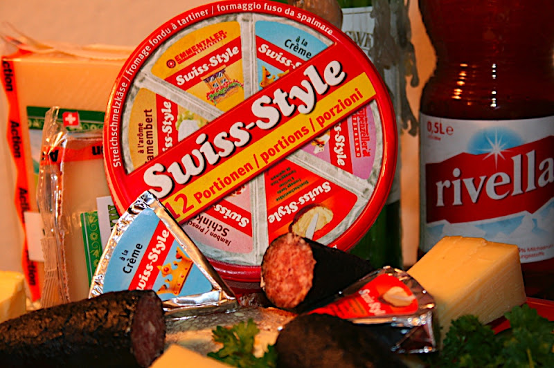
No, this post isn't about cheese, sausages or Rivella. The last part of the semester has started this week. It´s the last 4 weeks of my time at the Zurich University of the Arts and of my genuine Swiss design education. I still remain true to my resolution to attend as many design related conferences and events as I possible can and make the most of my time here. Today I went to a panel discussion about Swiss Style. Richard Hollis (design writer, London), Manuel Krebs (NORM, Zurich) and Lars Müller (Publisher, Baden) discussed the history and future of Swiss graphic design and what became known as International Typographic Style. A Style that for some reason is particularly popular in Britain today, where some graphic designers seem to be more Swiss than the Swiss themselves.
It was an interesting though somewhat chaotic debate. Richard Hollis as author of various books, in particular "Swiss Graphic Design" obviously had a lot to say about the history of this subject matter. So much that it was difficult to stop him when he reminisced about the golden age of geometric shapes and sans-serif type. Interesting for me was that he suggested it was the left-wing element in British designers that made them feel attracted to Swiss design. Also that Gill Sans had associations with religion and was therefor not the typeface of choice for British designers despite being the only British sans-serif around at that time was a new and interesting notion for me.
Lars Müller attempted to explain the development of Swiss design in post-1968 times, after the revolution which brought the younger generation to dismiss the Swiss style because of its associations with corporate power for example. He also had a theory about why Swiss design became successful despite similar developments at the same time in different parts of the world: the Swiss are disciplined and cautious, this helped them during the war and it made the whole world admire them. Well, I'm not too sure about this theory, not least since he had to explain it three times to the rest of the panel. A valid opinion though, just like his opinion that Brody and Carson were "nothing", "only a moment in history" and "not worth talking about". As clumsy as his debating style may seem, but there was something likeable about this man.
Manuel Krebs from the renowned design studio NORM shared his view of contemporary Swiss graphic design. He also explained how he and his partner Dimitri Bruni have always been trying to find something that´s different rather than just following a style. They were influenced by postmodern British and American design eg. Neville Brody and David Carson. In a way they then tried to break out of the 'chaotic' new design trends and felt drawn towards clarity and structure. That´s how they became admirers of grid systems, though attaching less importance to the structure and more to the content. In other words: not the grid is important, it´s what you do with it.
And grids were pretty much the focal point of the rest of the debate. Hollins explained that grids have their roots in technical constraints, for example in letterpress printing where it was necessary and made sense to work in a geometric grid system. He found it astonishing that these days designers are still keen on rigid grids and rules even though technology has liberated them. He is suspicious about the grid hype but even Müller-Brockmann used grids in situations where there was absolutely no need for it. Krebs noted that design has always been about technology. Letterpress influenced design as much as digital media does but one has always informed the other.
Lars Müller is clearly opposed to the grid debate. He said "the grid is a metaphor for lack of self-confidence". Today designers spend too much time talking about grids and typefaces and don't even know what they're talking about. They need to go back and learn the basics and then focus on the important things. Grids are there mostly for economic reasons. Designers don't need to reinvent it over and over again, this defeats the point of a grid system. Krebs partly agreed with him and suggested that certain things are tried and tested eg. Swiss style for information systems. This is why NORM is heavily making use of grids in their designs.
Müller suggested that design needs experiments but some things like signage or information design shouldn't be messed with. For this we have grids. I'm not sure if he actually knows of the more experimental, totally unconventional yet very successful examples of information design particularly from the fields of digital data visualisation. I don't think he knew what he was saying either when he said "Swiss style is the manual for driving spaceship earth". He might have been inspired by Buckminster Fuller—but honestly, this statement doesn't make any sense, does it?
Needless to say, the panelists didn't find an answer to the question ´swiss style forever?'. Perhaps there´s no need for an answer to this question. It´s not the style that makes good design. The style or form just serves the purpose of communicating a certain information to a certain audience. If the audience expects Swiss style, then grunge is not appropriate. If they expect grunge, then Swiss style will be considered too rigid and corporate. It completely depends on the context. For me, one of my highest ethics in design is usability and clarity. Therefor I'm probably going to stick with a Swiss style informed approach, not as a slave to grids and rules but as a creative individual empowered to use the style as a tool for information architecture.
There was only one thing that they all agreed on: good designers don't go into advertising.