Thursday, 30 April 2009

The future is now or what?

Last weekend I had the great opportunity and pleasure of going to the tweakfest conference and exhibition at the Technopark in Zurich. The Tweakfest Digital Culture & Lifestyle Festival presented for the third time the best of the digital avant garde. The conference had many interesting speakers from all over the world. The motto "InterFaces" encouraged the participants to discuss interfaces between humans and machines, between humans and humans or between real and virtual worlds.


The keynote was held by the British futurologist Dr. Ian Pearson, who outlined a very futuristic view of the next 50 years in technological advance which reminded me a lot of the Discovery Channel documentary '2057'. Like the documentary his lecture left a sci-fi taste which made me chuckle at some points and nod at others. I think his main point was that we need more advanced technology, not go backwards as some 'green' folks suggest. We won't save the world by getting rid of cars. This, according to Dr. Pearson, is the wrong way. We need to innovate in order to solve problems such as pollution and climate change for example. Nature is stupid, it needs technological help. The faster you change your mobile phone, the faster you move to a smaller, better and more efficient version. Obsolecense is a good thing, it leads to faster innovation and advance. Dr. Pearson predicts that by 2020 we won't have mobile phones or laptops anymore. They will be replaced by 'digital jewelry' e.g. active contact lenses, an idea conceived by Pearson in 1991. Of course his presentation left a rather humourous and science-fiction like impression but I think there´s a grain of truth in it. When at some point your CEO will be a super intelligent hamster, where does that leave human intelligence? Emotional intelligence becomes more important and interpersonal skills are crucial to keep employable. On a different note, when I look at Dr. Pearson´s website I wonder what role design will play in the future.


IMG_1539.JPGIMG_1547.JPG

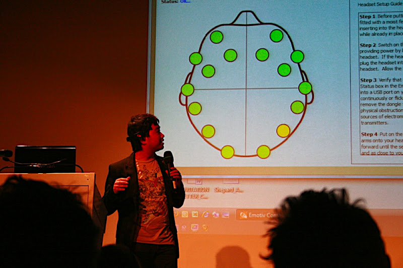
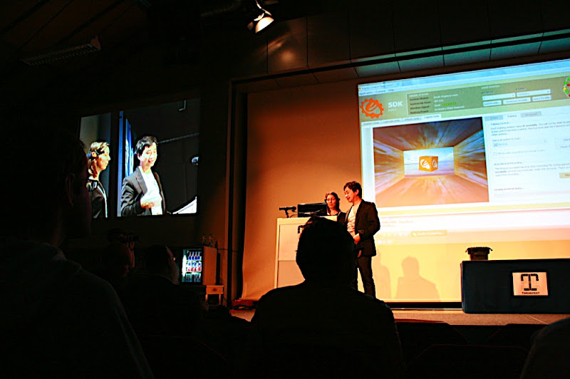
I was very impressed by the presentation of Nam Do, CEO at Emotiv Systems. He presented the EPOC neuro headset, a bluetooth device that allows users to control a computer with their mind. It´s certainly not a new idea (and one that was featured in said documentary '2057' as well) but I was very surprised how far it has been developed already. Nam Do announced that the headset will be released this year. This means we could probably see a new generation of games. The Nintendo Wii and the iPhone/iPod touch with accelerometer technology already revolutionised the market, now we could see games where it´s not only possible to control an avatar with your mind but also to adjust the level of difficulty automatically according to the user´s level of engagement or excitement. So far the system needs tedious calibrating and training but give it a few years and we can type by using our mind. Not too far from visualising thoughts. Exciting stuff.


Moshe Rappaport gave an insight into the IBM global technology outlook. Interesting was his explanation of 'digital natives' and 'digital immigrants', users that grow up with technology or adapt to it later in life. The aim of technology should be to bridge the gap of these two groups. Engineers always think in terms of how to make things faster or better, how to put more pixels on a screen or improve processor speeds, etc. According to Rappaport this isn't enough anymore. The social component is most important today. If your focus is on technology, you're going to build interfaces for technologists. User centred design is key today. Despite him being an IBM person and therefor disliking Apple, he praised the iPhone for it´s ability to bridge the gap between digital natives and digital immigrants. Other applications should follow this example.


IMG_1559.JPG

IMG_1565.JPG

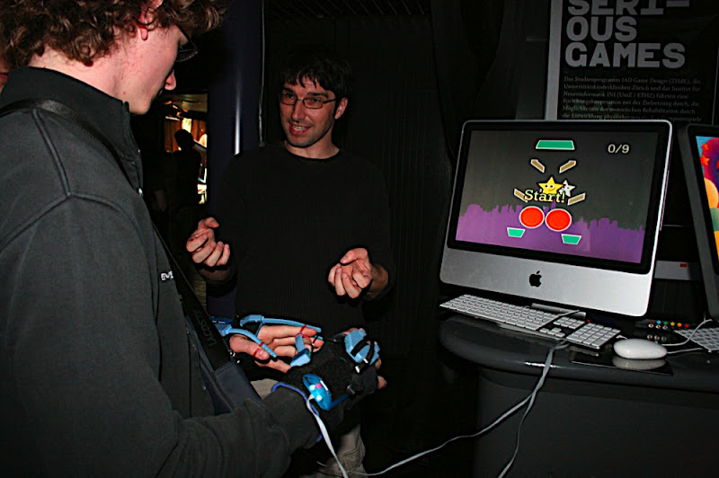
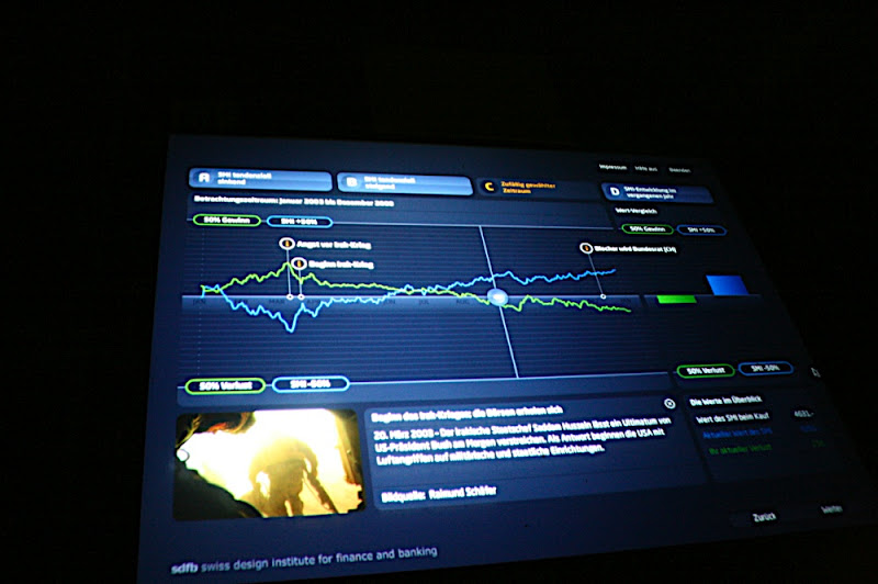
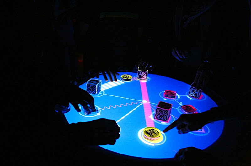
The Exhibition at the 'Alte Börse', the old stock market in Zurich had some very interesting artifacts of digital culture and lifestyle. My guest uni, the Zurich University of the Arts, presented some ´serious games', applications that help with the rehabilitation of children through computer games that involve movement. They also had some of their multi-touch tables to try out and applications from the area of information design, one that informs about their projects and another one designed to help banks to communicate with customers and help them to choose the right financial package based on different decision factors.


IMG_1555.JPG


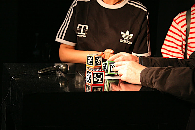
The well known experimental musical instrument reacTable, developed by the university of Barcelona, became famous through Björk´s Volta tour. Here I had the chance to play with this 'musical instrument of the 21st century'. Another interesting interactive game is levelhead by Julian Oliver. It´s a little cube that you move in front of a camera and different rooms are revealed on the screen. You move your avatar through these rooms by moving and shifting the cube. Really good fun.


IMG_1553.JPGIMG_1554.JPG

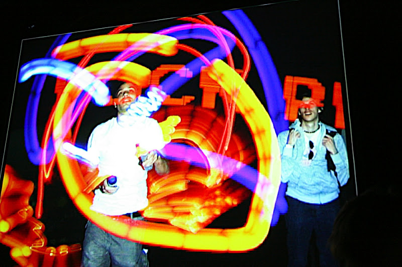
All in all I can say that I really enjoyed the festival. Beside all the invaluable stuff that I learnt, I surfed on a Wii surfboard over the alps in GoogleEarth and got accidently captured as a spectator in a digital graffiti session. But most of all it inspired me and got me interested in the future—which, apparently, is now.


IMG_1558.JPG

Tuesday, 28 April 2009

Visualising Biodiversity

Convergence as a very broad and generic term is suitable for interdisciplinary education, because it describes a phenomenon not bound to a specific discipline and is also  the underlying concept of interdisciplinary work. The course "Geo Visuals" was provided by the specialisation Scientific Visualisation. Because I teamed up with a Game Design student, together with Visual Communication and Interaction Design / Game Design, three disciplines converged. The project "BiodiverCity" that we chose also showed convergence of different competencies from the fields of social science and ecology. Thus there is a link between art and science, combining engineering and aesthetics. The result is a synergy that stands out through its balance of differences and effective technical problem solving. Through the work across different programmes of study, we benefited from an active discourse as well as different approaches and technical skills.


The objective of the course "GeoVisuals" was the work with different forms of landscape visualisation. Modification and development of landscape models was encouraged as well as the play with illustrative elements within visualisations based on scientific data. Starting points were for example scenarios of landscape and spacial design, environmental planning, reconstruction or basically all visualisations that provide structural and navigational information in a spacial environment. Important was the combination of different media (e.g. digital & analogue, sound & image or 2D & 3D). To encourage the convergence of competencies, short introductory workshops in various techniques were offered:

  • Storyboarding

  • Input Second Life

  • GoogleEarth / 3D-Design with SketchUp

  • Illustration techniques

  • Video editing / AfterEffects


The process was presented to the group in two interim presentations. Expected result of the course was a series of designs, explaining the appearance and function of the landscape visualisations in the form of short video sequences.


falle.jpg
© Fabio Bontadina / biodivercity.ch

Our project: "BiodiverCity". More and more people live in an urban environment and in metropolitan areas.  However, now cities feature a surprising amount of nature, from local and imported plants to  cultivation close to nature in residential areas and parks. Hence it is becoming more and more important to understand the social and cultural connections between notions of biodiversity and quality of life in urban areas – not least with consideration towards a sustainable development of urban residential areas. The project BiodiverCity seeks to understand the links between urban biodiversity, the built environment and the perception through residents. The results will be used to develop methods to raise awareness for biodiversity in residential areas and improve residents’ acceptance of it. In an attempt to determine the biodiversity and the influencing factors, the numbers of different species of birds, bats, insects and spiders respectively were counted in the cities Lugano, Lucern and Zurich. For that, 32 measuring spots were defined in each of the three cities. The result shows that all three of them show a surprisingly large biodiversity. Several species had never been seen in Switzerland before. The appearance of green space is a determining factor for biodiversity. A representative survey in Switzerland shows that particularly people living in urban areas give special value to green spaces as these form a contrast to the built environment. Green spaces with a variety of structures that look close to nature yet well-kept were favoured by residents. The challenge for us in the scope of this course was the application of design under two aspects. On the one hand, the survey results were to be visualised, on the other hand we were to raise awareness for biodiversity and make biodiversity-friendly urban landscapes more attractive to residents.


ausgangsmaterial1.jpg
© Roland Hausheer, Illustrator, Hochschule Luzern Design und Kunst / biodivercity.ch

The material that we started to work with consisted of various photographs of the spots where the data was collected as well as computer generated Imagesy showing prototypical green spaces which had been used for the survey. Later we got access to the recent research results as well as a concise list of species with the appropriate statistical data.


In the first brainstorming, we noticed that the co-existence of humans and animals could be an interesting aspect. We could visualise the environment in a way that allows us to make processes and activities visible. Changing the roles of humans and animals could help to raise awareness by showing what an insect’s view of the world and of humans looks like. Showing that the insects’ «living spaces» are directly influenced by how humans keep their green space could make clear to the population that they are responsible for them. Perhaps changing the viewpoint to the eye level of a beetle could show how insects actually feel at home. Interesting for us was the idea of diving into the lawn in front of one’s home.


idea.jpg
1-2: © Tele Atlas / Google, 2009; 3: http://outdoors.webshots.com/photo/1341319181068749389ENwwU

An idea was to use the possibilities of GoogleEarth® und its 360° spheric panoramic images to "dive" into urban green spaces and be encouraged to discover a new world. Another idea was to create various information graphics and visualisations for exhibitions in the residential areas or for online and print media (e.g. books, brochures, posters, etc.).


We presented the results of our initial idea generation process to the  person in charge of the ecological part of the research, Dr. Fabio Bontadina (zoological institute, University of Berne). Dr. Bontadina explained the project in more detail and made clear that communicating the new findings in a new, interesting and innovative way was their main aim. The previously mentioned aspect of the symbiosis of humans and animals was not a new phenomenon. It has been described under the term «urban ecology» for the last 50 years. A new approach is putting the notion of biodiversity into the centre of attention. Biodiversity is currently described as being synonymous to wealth, regeneration, experience and life. Dr. Bontadina suggests to look specifically at at some chosen results and keep the main aims in mind. A starting point could be the visualisations of a prototypical urban green space that had been used for the survey. We could develop them further in a way that allows us to make as many aspects and results as possible visible and comprehensible.


barchart.jpg


We took the statistic data of the survey, which was given to us in a 12 page document, and presented it in a visual concept. Through bar graphs we visualised the quantitative information and made its dimensions comprehensible. Starting with the bar charts, we noticed the similarity with installations that have been used to communicate and visualise data in public spaces. This inspired us to choose this medium for our own visualisation.


planetenweg2.jpgplanetenweg1.jpg

The planet trail on the  Üetliberg (Zürich), designed by Arnold von Rotz, is such an example for an installation that communicates abstract information in a public space. Other examples are Edward Tufte´s Escaping Flatland or Bird Series.


installation4.jpginstallation3.jpg

installation2.jpginstallation1.jpg

At first we created some sketches for a 3-dimensional installation which was to represent the survey data in the space where it was collected. This way, the data which was collected through the BiodiverCity project could be made accessible and understandable to the public.


objects5.jpgobjects4.jpg

logo2.jpglogo1.jpgpictograms.jpg
Hardau Türme: © Stadt Zürich / www.stadt-zurich.ch

The installation combines symbolically the living spaces of humans and animals to highlight the aspect of a symbiosis and mutual habitat.


objects3.jpgobjects2.jpg

objects1.jpg


The objects, which represent the different the collected data through their variation in size are made of wood and sealed with weatherproof and environmentally friendly varnishing. The front contains pictograms corresponding to the species (cf. page 29), the back contains a list of the species found in a comparable habitat. The natural looking wooden core stabilises the object and lends a natural aesthetic. Different shapes and colours were used to represent the appropriate data collected for birds, insects, spiders and bats.


panorama.jpg


landscape4.jpglandscape3.jpglandscape1.jpg


landscape2.jpg


The installations were to be complemented with an information panel which informs about the collected data and the BiodiverCity project. A prototypical landscape visualisation was created which combines all the landscapes that were originally included in the survey. This allows us to display the results in a way that is clear, interesting and aesthetically pleasing.


Infotafel-final.jpg

The idea was presented to the year group with a one minute video clip at the end of the module. The interim presentation and a rough concept was given to our contact person at the BiodiverCity project, Dr. Fabio Bontadina and received positive feedback throughout. The final result as well as the project documentation were sent to the project supervisor and are going to be suggested to the organisers of the biodiversity year 2010 in Zurich. We can imagine to engage in future collaboration with the BiodiverCity project and wish to thank them for supporting our work within this module.


implementation3.jpgimplementation1.jpgimplementation2.jpg


And in case you're wondering what a "module file" looks like here, feel free to download the documentation or flick through it online.

Monday, 27 April 2009

Convergence and interdisciplinary design practice

When I was asked to sign up for a "convergence module" back in December, I didn't have a clue what this was supposed to be. The 4 week and 6 credits module had a number of sub-modules to choose from. I picked an interesting sounding module entitled "Geo Visuals". It was run by the "Scientific Visualisation" course and apparently was about visualisations of geographic data. It sounded intriguing, so I signed up. Now this module had kept me busy for 4 weeks and I'm pleased with the result.


The whole module was basically about interdisciplinary design practice ie. students of the whole department of design could try out fields that are outside of their usual area of specialism. The module was accompanied by a number of lectures held by international guests from other universities and the from industry. The lectures were concerned with convergence in the widest sense, ranging from convergence design to convergence of disciplines or convergence of media etc. Within the different sub-moduls or courses we could choose a specific project, team up with other students or come up with our own project. The outcomes were presented to the whole department and also uploaded to a blog so everyone could check out what the other students were doing.


I teamed up with an Interaction Design/Game Design student and chose to work on a live brief for the project "BiodiverCity", a national research project that involves the Swiss Federal Research Institute WSL, the University of Berne and the Urban Ecology & Wildlife Research Group. The aim was to visualise research data connected to a recent study of biodiversity in urban spaces.


The final result was presented as a video sequence to the whole department of design and followed by an apero, as you might expect. Yes, free beer and wine from the uni to celebrate students hard work and success. Kind of what they tried once last semester, when they offered us chocolate—just for adults.*


It was a very enjoyable module and I met a bunch of new people from disciplines that I previously didn't know much about but I'm glad that I had the chance to get to know them.


And what exactly we did in this project, will be published here soon.


idea.jpg


* I'm not complaining about the chocolates at all but maybe suggesting that a social event, where people automatically start discussing what was good or not so good, seems be the cleverer incentive.

Thursday, 23 April 2009

I'm stupidly excited

I have received my ticket for tweakfest and know what I'm going to do this weekend:


«interFaces» conference
At tweakfest 09 - the networking and information platform for the digital avant-garde, the theme of the conference is interfaces such as that between man and machine and between reality and virtuality. Creative artists, designers, researchers, communicators and managers are invited to join the futuristic discussions on Friday the 24th of April 2009 at the Technopark in Zurich, Switzerland. Be inspired and meet the leading International and Swiss thinkers on how our digital life will look like in the future from a cultural, scientific, communicative and business point of view.


The line-up looks very promising:


  • Keynote - Ian Pearson: “A Trip to the Future”

  • Demo - Nam Do: Your Mind controls Virtual Worlds

  • Moshe Rappoport: IBM Global Innovation and Technology Outlook

  • Demo - Oliver Goh: Intelligent Shared Spaces, Building Worlds without Boundaries

  • Lecture: Alfonso von Wunschheim, CEO local.ch presents Online Advertising in Hyperlocality

  • Demo - Iñaki Vázquez: Ambient Intelligence and the “Internet of Things”

  • Lecture - Leo Keller: Web 3.0 and Semantic Web Interfaces

  • Lecture - Gerhard M. Buurman: Intersection between Design, Art and Technology

  • Lecture: Monika Fleischmann: Wohin mit der Medienkunst?


There´s also a number of exhibitions, performances and workshops and I'm stupidly excited about this.

Wednesday, 22 April 2009

It´s going to be an ok summer

Where else in the world would they let you off work to see a giant snowman burn with a load of horsemen gallopping around it? Every year in April, the traditional guilds of Zurich demonstrate how good they are through parades, throwing candies and buns and the burning of the Böögg, a plastic snowman representing the winter. This is also Zurich´s most popular weatherman as the explosion of its head indicates the prospective quality of the summer to come. Afterwards, Zurich´s left and hippie scene takes over and barbecues their sausages and cheese over the remainders of Mr ex-winter.


This is obviously a very vague outline of the event but since I'm extremely busy at the moment, I hope that images illustrate it sufficiently. If you want to know more, I recommend the website of the fest www.sechselaeuten.ch. Just so much: the head, filled with explosives, gave way to an ok summer after roughly 12 minutes.


IMG_1458.JPG


A click on the Pic takes you to my photos of the Sächsilüüte.

Friday, 17 April 2009

Paz and the Chocolate Factory

IMG_1331.JPG


Sometimes you have to treat yourself. So despite the looming deadlines, I took the morning off and joined a trip to the Frey chocolate factory. Frey is one of the largest chocolate manufacturers in Switzerland, they produce mainly for Migros but also for Marks & Spencers in the UK. With a loot of three and a half kilograms of chocolate in my bag I returned to uni in the afternoon, feeling a bit dizzy after eating as much of the Swiss speciality as I could.


IMG_1339.JPG

Thursday, 16 April 2009

Spring in Zurich

IMG_1310.JPG


In the last post I was still playing in the snow, now spring appeared out of nowhere. Sun every day, 25 degrees, a completely white tree outside my window, birds chirping, shorts and t-shirts, parties at the lake—but I have to work. As usual. Ah well, life of a design student. I'm currently taking a module taught by the Scientific Visualisation course and while I'm still busy visualising quantitative data relating to geographic visuals, I'll let you enjoy some spring photos.

IMG_0737.JPGIMG_0756.JPGIMG_0773.JPG

Saturday, 11 April 2009

My first book on Amazon

While I'm still digging through sources and texts on the impact of commercial contexts on creative practice for my current essay (any tips?), designing an installation to visualise quantitative information of a national survey of biodiversity in urban spaces for my recent project in the scientific visualisation module (any suggestions?), eating a 30cm tall easter bunny made of white chocolate and all the other things that you do at Easter, I noticed by chance that my book "How to Make a Paper Hat" is available on Amazon now and will be printed and shipped on demand. Alternatively you can go to your local book shop and order the book by its ISBN 1409260461. Am I a published designer now? Happy Easter anyway!


amazon.jpg

Thursday, 9 April 2009

Sun, snow and a night in jail

Don't hyphenate st, because it hurts them. That´s a rule of thumb we learned in primary school and in German it rhymes. About combining the two letters however, we learned relatively little. Some designers seem to show off their typography skills or at least their interest by doing so. Whether or not using the st ligature is appropriate or even pretty—who knows? When we proposed our storybox logo, we got criticised for using the ligature just for the style. However, we decided after due consideration that it supports the idea of the brand and offers an added aesthetic value. Looking at the logo of Lucerne Festival though, I don't understand what the aesthetic value is here.

Picture 101.png


The logo caught my eye because in my opinion the ligature is used very inappropriately here. The logo is set in Quadraat bold and uses only uppercase letters. I only know of lowercase ligatures though, so what I see here is some sort of hybrid glyph. The two uppercase R and N were probably merged to get a smoother flow. I just wonder why in the middle of the word they combined the uppercase S with a lowercase t by drawing a very strange looking ring above it. Not least since the rule is not to use ligatures across syllables and festival is hyphenated fes|ti|val in German as well as in English. Is it all about the style in the end?


But Lucerners are special anyway. I learnt that last weekend, when I took a closer look at the idyllic little town. While Zurich is rather a busy place, in Lucerne you can find the slow Swiss stereotype. Amazing how different the culture is an hour further into the country. From Lucerne it´s also easy enough to get to Engelberg, a small snow sports resort in the middle of the alps. So Matt (who was visiting) and I could enjoy sun and snow at the same time and even spend a night in prison. But have a look at the photos.

SDC11861.JPGSDC11852.JPGIMG_1083.JPGSDC11837.JPG


In addition: The thing about the ligature wouldn't be that unusual if it wasn't designed by the noone less than Meta Design. They explain it as a "perfect analogy to the legato ties in musical notation". Well, I don't know ... this wasn't exactly what crossed my mind when I first saw it. But perhaps I'm just not the target audience.

The whole thing can be read here.

Thursday, 2 April 2009

Designing and redesigning Storybox

After going through the process of developing a concept and initial design for the cross-generational social network 'storybox', I decided to rework the final design and give it some finishing touches. Because we worked on the project with four different people with equal sharing of roles and responsibilities, it meant that the design was compromised through our different tastes and opinions. The result was great and worked really well, however it didn't live up to my personal ambition. The improvements that I made was mainly in the colour palette and the logo. I made minor improvements to the timeline and general navigation.


site_entwurf_6-1.jpgstorybox_welcome.png


I dropped the black/white/red colour palette that we previously decided on and chose one that was closer to our original inspiration, an old attic where a box filled with stories was found:


Picture 98.png


Picture 99.png


The sharp corners were rounded off and make the website appear smoother, less technical and more welcoming. I felt that the long discussed logo was lacking something. The ligature was a good idea and communicates the concept and identity of storybox well, but adding a traditional hedera was just that little bit that was missing. The hedera or aldus leaf is a stylised ivy leaf and one of the oldest typographic ornaments. It was traditionally used to seperate paragraphs in long documents. Today it is rarely seen but still carries literary connotations of books and stories. It was pointed out that it might look too similar to the logo of the popular publishing house Hermann Schmidt. However, I don't think the target audience of storybox is likely to make this connection since this pulisher is targeted at a German speaking designer audience (which is why it was pointed out in the first place). The ivy leaf gives the logo a warm, ornamental and friendly character and appears in other parts of the website too.

The project got marked with a B+ which is equivalent to a 2.1 in England or a 2+ in Germany. The final design and an animated prototype demo can be viewed here.